Mohsen koofiani Mohsen koofiani
  • Home
  • Features
  • Awards
  • Resume
  • Portfolio
  • Blog
  • Contacts
Mohsen koofiani
  • Home
  • Features
  • Awards
  • Resume
  • Portfolio
  • Blog
  • Contacts
find with me

Projects Category: Awards

  • Home
  • Awards
Awards
2747

Bronze A’ Design Award Winner for Dried Fruits Packaging Design (Apr 2024)

Bronze A’ Design Award Winner for Dried Fruits Packaging Design (Apr 2024)

LIKE THIS 2747

In this packaging, the designer has left a special artistic design by using various fruits, and art history (sculptures and art paintings) and combining them with animals, such as preserving the works of art left behind.

In this design, most of the artistic sculptures of the cultural history of the world have been used, of course, it should be noted that subtle changes have been made in them. In the pictures, a clear connection has been established between the creatures, selected fruits, and historical culture. But since the main theme of the packaging is the idea of preserving the ecosystem, in addition to vegetarians, wild animals (hunters) have also been used as a symbol of power in some places. According to the main message of the packaging (environmental protection), degradable packaging has been used.

Fruits have a special place in nature for all living beings, and the interaction between humans and animals can be seen in these images. Basically, one of the goals of design is to respect the ecosystem, and our consumption and lifestyle can be very important in this matter. Another goal of this project is to establish a relationship between culture and the correct way of using food resources, which is closely related to this ecosystem.


Awards
2717

Bronze A’ Design Award Winner for Nuts Packaging Design (Apr 2024)

Bronze A’ Design Award Winner for Nuts Packaging Design (Apr 2024)

LIKE THIS 2717

Each food has a special effect on your senses and reminds you of an event. The designer was looking for a way to create a special mind and bring the viewer with him. So, an idea was taken from the world of the unknown and to show exciting things in this different world, a character who can do exciting things was needed and he is none other than Mr. Hernuta. After that, Mr. Hernuta’s days with various nuts were formed.

The character of Mr. Hernuta is one of the unique features of this package, which has an adventure with nuts. Other features of the design are white packaging and the creation of special and different nut machines.

consuming nuts creates a lot of energy in the body and as a result, is happy. Therefore, the packaging design is done in such a way that it can transfer this energy to the viewer.

The designs are created manually and each product has its design. The designs are drawn with a pencil and executed with the same technique (black pen). Each nut is creatively equipped with a series of tools such as wheels, cameras, lights, etc.

Awards
2751

Bronze A’ Design Award Winner for Pet Foods Packaging Design (Apr 2024)

Bronze A’ Design Award Winner for Pet Foods Packaging Design (Apr 2024)

LIKE THIS 2751

Simple and uncomplicated images, simple and uniform colors with high contrast are always attractive and this design is inspired by the simplicity of animal life. Uncomplicated and completely clear life.

Normally, because we humans consider pets as members of the family and like our children, packaging design is designed based on the viewer’s view of a kids. The use of characters can strengthen the relationship with the viewer and create an attractive environment color. As a result, the packaging has better visibility and better communication.

Pet food packaging is completely conventional packaging and is not particularly complicated. What distinguishes this packaging is the use of colors and a simple form in its design.


Awards
2720

Iron A’ Design Award Winner for Drink Dessert Packaging Design (Apr 2024)

Iron A’ Design Award Winner for Drink Dessert Packaging Design (Apr 2024)

LIKE THIS 2720

The design is inspired by the fantasy world of children. In the illustrations, each child imagines himself in the same world according to the taste of his favorite fruit. The design of children’s world needs to know their spirit, and for this design, necessary research has been done and children’s mentality has been used.
The packaging design is related to a dessert drink in different fruit flavors. According to the design, it is clear that this design is specially designed for children. The harmony between the designs is clear in different flavors and they all have a rhythm with stunning and attractive and sharp colors. The hair of the characters is drawn upwards in a special way so that it is shown like the product inside the package and directs the movement of the eye towards the name and type of dessert.
The happy and carefree colors used in this packaging and the cartoon characters and its fantasy-dreamy atmosphere play a very important role in communicating visually with children. The attractiveness of color is the key tool of this packaging for better interaction and impact.

Awards
2023

Iron A’ Design Award Winner for Ice cream Packaging Design (Apr 2024)

Iron A’ Design Award Winner for Ice cream Packaging Design (Apr 2024)

LIKE THIS 2023

As it is clear from the name of the brand, all the design ideas are taken from England. Simple and dynamic character design inspired by famous British icons and characters.

The use of old design patterns and different colors and well-known characters of England, each of which has different stories to tell, are considered unique features of this design series. The designs are such that it represents the name of the brand and its country. Next to the packaging, there is a direct reference to the type of product and its contents.

The colors and characters in this packaging have been able to depict the identity of the brand, and the simplicity of the characters and the passionate coloring of the design do not target the packaging to a certain age range and attract everyone.

Awards
1988

Iron A’ Design Award Winner for Ice cream Packaging Design (Apr 2024)

Iron A’ Design Award Winner for Ice cream Packaging Design (Apr 2024)

LIKE THIS 1988

The inspiration for this design is music. A song has different effects in different parts. This is also the case in the enjoyment of eating ice cream. Tastes and feelings are like musical notes and have different effects depending on the environment and place.
In this design, the name of each product is compatible with the illustration on the packaging, such as solo, duette & … . Eye-catching illustrations with special techniques and various colors are other features of this packaging. These things create focus and visually the viewer’s eye remains fixed and curious. Another feature of the package is the focus on the music and the musician.
The relationship between excitement in listening to music and eating ice cream. This is an interaction. Different feelings when listening to music are like the excitement of eating ice cream. The pleasure of each represents the feeling we need at the moment, and having each at the same moment balances the inner state and gives a good feeling. During the design of each of the designs, the designer listened to the same style of music and familiarized himself with the same topic so that he could coordinate the illustration with the music.

Awards
2239

Bronze Award Winner / Digikalaprize Award 2023 / Magic Box

Bronze Award Winner / Digikalaprize Award 2023 / Magic Box

LIKE THIS 2239


Awards
2316

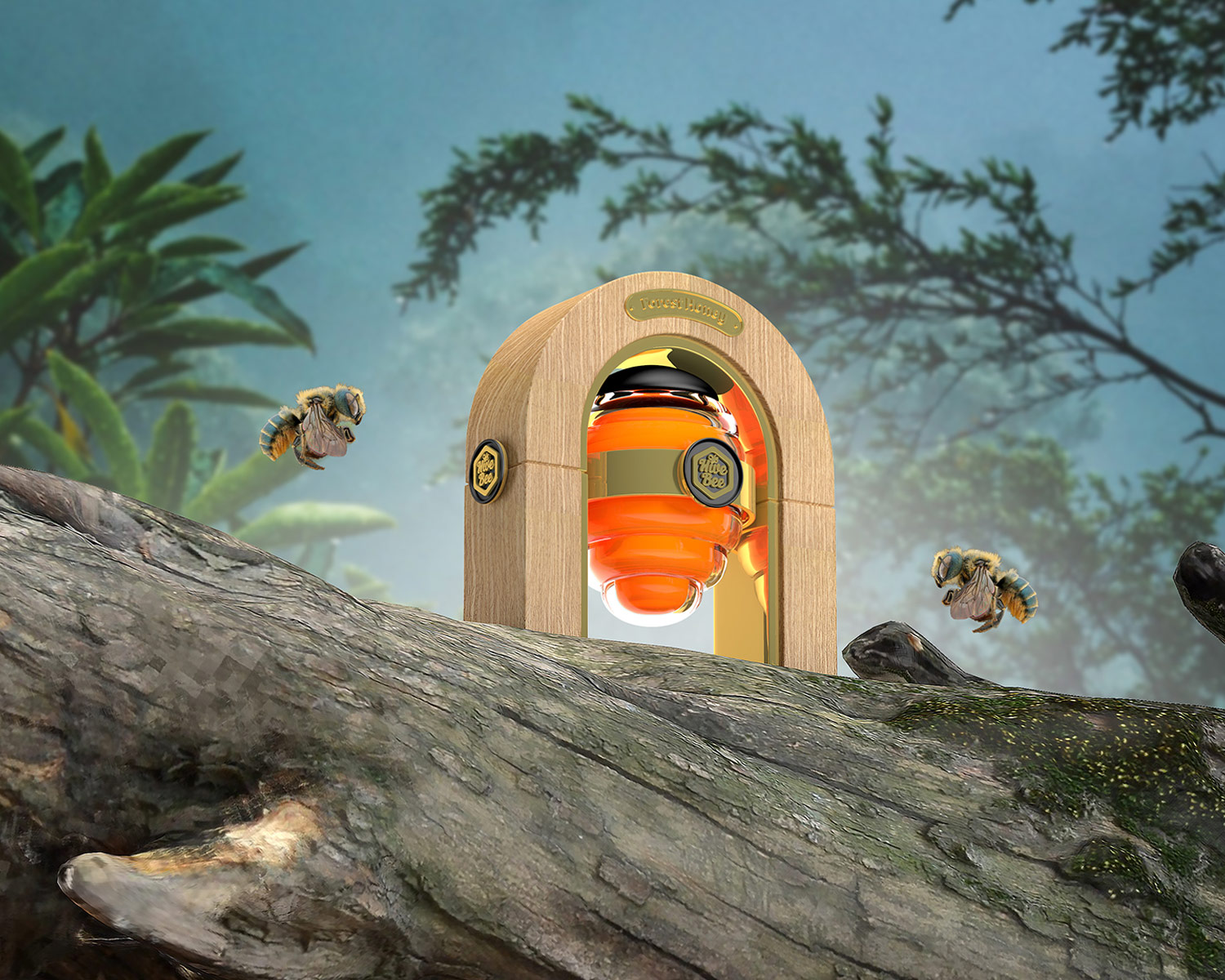
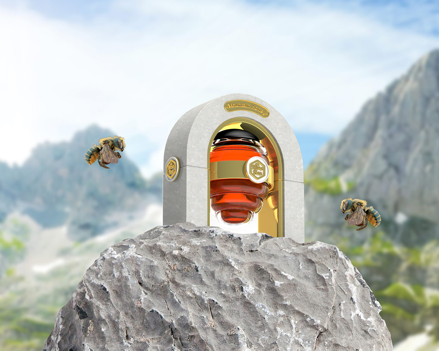
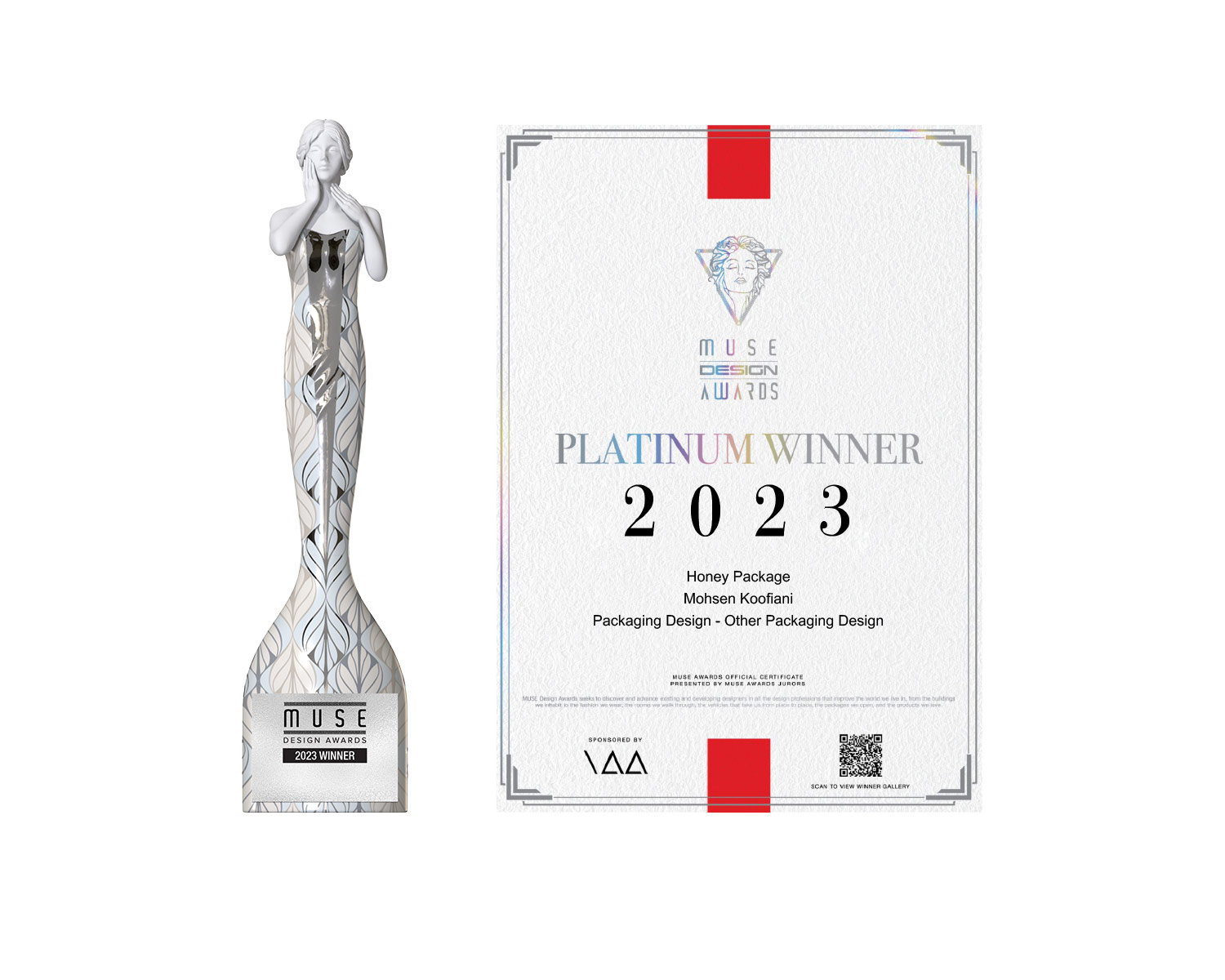
Platinum Award Winner / Muse Design Award 2023 / Honey Package Design (Sep 2023)

Platinum Award Winner / Muse Design Award 2023 / Honey Package Design (Sep 2023)

LIKE THIS 2316

Category: Packaging Design

The design idea is inspired by nature. The design is a combination of different materials for a better understanding of the product with high durability and can be up to 80% environmentally friendly. This plan is a concept that has been concluded due to a lot of research and study and it is not impossible to achieve it. One of the important features of this plan is the interaction of the package design with the specific product inside it and the use of the product’s outer packaging to create a suitable platform for flower work to promote the protection of the environment and the protection of honey bees.

The packaging consists of different components and the design of the package is considered quite simple to show the nature and materials used in the packaging. This is a different packaging and presentation of honey that shows the real and natural nature of honey in small dimensions. Forest honey using wood material as a symbol of forest trees and mountain honey using light cement as a symbol of mountain stones introduce themselves.

The general packaging form is a symbol of a beehive, which consists of two parts, and the base part is used as a practical tool to make a vase. The internal packaging that presents the honey consists of a wooden or cement arch to which the honey jar is attached like a beehive that hangs on a tree or rock. This is the main idea.

A honey jar and honey spoon are placed next to the package. The honey jar can be separated from the base to be washed and refilled with honey.

The main goal has been to present a different packaging of honey to remind the natural process of honey production and support the environment and bees.

Posts pagination

  • 1
  • 2

Featured posts

PARSIRANG
  • January 7, 2024
  • 0 min read
ITOOK Drinks
  • January 7, 2024
  • 1 min read
ANIMAYO POSTER 2021
  • January 7, 2024
  • 0 min read

Categories

  • Advertising
  • Blog
  • Concept
  • Illustration
  • Logo design
  • Packaging designing
  • Photography

Find Me